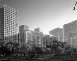
Jian Wai SOHO is simply one of the developments that China is undertaking in an effort to rapidly industrialize and modernize. Like other mega-projects that are high-rise developments, it has been designed to project a ‘trans-national’ image of Beijing.
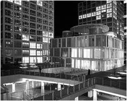
PROJECT: Jian Wai SOHO
LOCATION: Beijing, China
BUILDING TYPE: Residential, Commercial
ARCHITECTS: Riken Yamamoto & Field Shop
CATEGORY: Urban Infill
YEAR: April 2004
AREA: 13.6 ACRES
THE CITY:
Beijing consists of 8 districts though the metropolitan area stretches far into the countryside.
The site falls under the Chaoyang district–Part urban, part suburban, Chaoyang around the northeast and eastern sides of the city, houses the newly coined CBD (Central Business District) around the China World Trade Center. This is the richest district in Beijing, the result, according to some, of the district’s good fengshui.
Main EW artery (Chang’an Ave.) runs just north of Tian’an Men square.
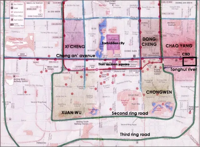
CONNECTIVITY:
Roads in Beijing are in one of the four compass directions.
‘Ringing’ of Beijing – The city is served by 4 completed concentric ring roads. The 2nd Ring Road runs where previously the old city walls had existed. There is a 3rd, 4th and a 5th Ring Road, the 6th is partially open and there is a talk of a 7th.
Metro Line 1 runs under Chang’an avenue. Beijing’s subway system is still evolving – there are 3 more lines, with several more being built in preparation for the 2008 Summer Olympics.
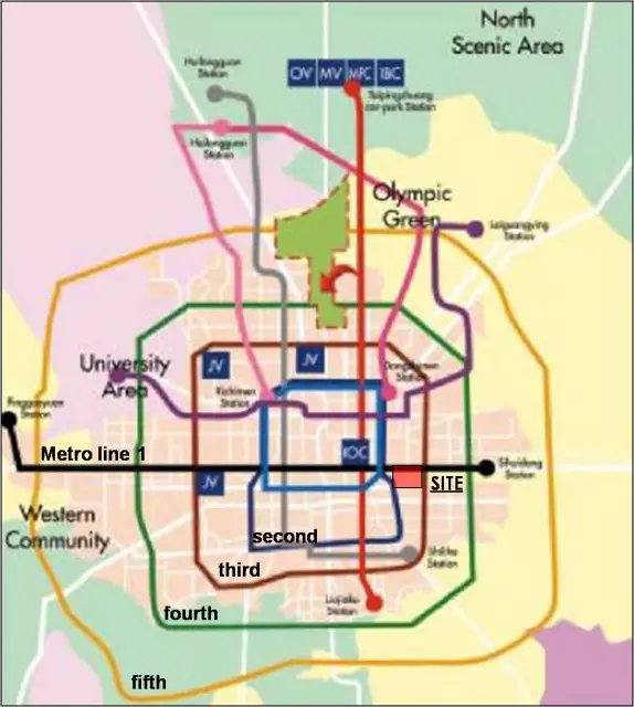
Five ring roads, nine expressways, and numerous fast through routes and National Highways all form a sophisticated traffic infrastructure.
LOCATION:
The site is located in Beijing’s frenzied CBD Area, opposite to CWTC (China World Trade Center), at the junction of the East 3rd Ring Road and the all important Chang’An avenue. CWTC Subway Station is in the north and the Tonghui River in the south.
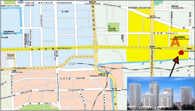

ACCESS:
Multiple pedestrian entry points from all directions.
Multi-level pedestrian walkways tied along public courts and segregation of pedestrian and vehicular traffic through levels.
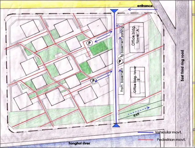
LANDUSE PATTERN:
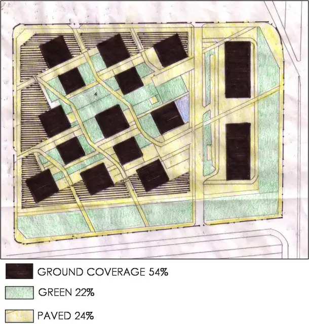
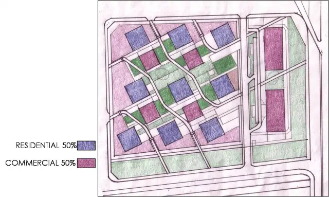
The commercial frontage about the periphery considerably increases the ground coverage and creates multi-level terraces within the premises.
Primarily conceived as residential, there is an effective blend of commercial in the wake of the central business district in the precinct.
CONCEPTION:
Jian Wai SOHO is simply one of the developments that China is undertaking in an effort to rapidly industrialize and modernize. Like other mega-projects that are high-rise developments, it has been designed to project a ‘trans-national’ image of Beijing.
Also, since winning the bid to host the 2008 Olympics, the city has experienced a sharp rise in the pace and scale of investment in urban infrastructure.
In 2001, the govt. called for development of 10 million sq.m of built up in the CBD area where Jian Wai is located. (Of this 5 million sq.m is new office space, 2.5 million is residential area and 2.5 million is hotels and other recreation facilities).
CLIMATOLOGICAL CONSIDERATIONS:
- SHAPE: The buildings are simple squares spaced in a checker board pattern so the perimeter areas of each tower receives abundant light and air.
- ALIGNMENT: Rotating the building slightly east – 35° from a direct southern exposure allows all sides (incl. northern facades) of the building to enjoy abundant natural light without compromising on the number of daylight hours. So now the corners of the buildings, rather than the sides, face due N,S,E and W.
- INTERIOR LAYOUT: The north corner of each floor is occupied by elevators and a communal sitting room; each of the other corners is occupied by a spacious corner unit.
There are only three households on each floor, which gives each household a full corner to itself which guarantees that each unit receives ample sunshine, maximizing the hours of available sunlight.
Furthermore, if by staggering the placement of the buildings, the distance between buildings can be reduced while preserving privacy.
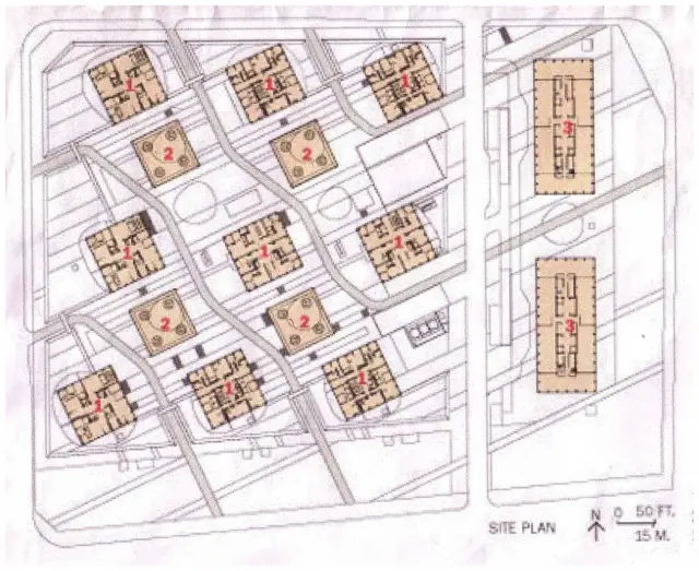
IMAGE:
Jianwai SOHO is characterized by the absence of a center, by multiple layers and vitality brought about by mixture .
MULTILEVEL SPACES
Definitely the most unique and striking aspect of Yamamoto’s design is the multi-level space between the buildings.
The top level features pedestrian walkways that connect the various buildings and allow movement through the site.
Seating and green areas are provided for at this level.
Below is the parking garage. The openings in the garage roof allow natural light to permeate the two levels below, while also making this component part of the development as opposed to what is commonly “out of sight, out of mind”.
This maneuver also adds another layer of activity to an area that could easily become a no-man’s land after time.
GLASS FAÇADE
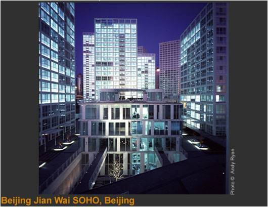
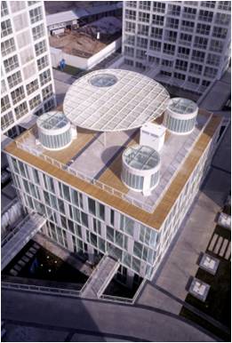
Uniform elevations of concrete frame with glass infill lend it a unique character, distinct from numerous high-rise in the area.
Extensive use of glass has also ensured maximum exposure to sunlight.
To learn more, visit: Comparision Between Barbican Center, Federation Square, BatteryPark City & Jian Wai Soho
This presentation was created by: Meghna, Nivedita, Sunny, Ved (2005)

Leave a Reply
You must be logged in to post a comment.