What will the best-dressed buildings be wearing this year? Follow the guide below for some style pointers…
Despite appearances to the contrary (black polo necks, black suits, black round Corbusier spectacles, black shoes offset with one luridly neon element), architects are as fashion-conscious as regular human beings. They just love a trend! Cast your eye over our skylines and it’s like flicking through Vogue – or, mostly, the shopping pages in Take a Break. First a style appears – sported by some avant-garde Isabella Blow-a-like such as Rem Koolhaas or Herzog & de Meuron – next thing you know every architect in the country’s copied it from the architectural magazines, run it up in their sweatshops and covered our high streets in it. One minute it’s edgy, next it’s your local Asda. Five years ago it was buildings shaped like wedges. Since the Gherkin, it’s all curves. Once Rafael Viñoly’s Walkie Talkie’s gone up in the City, though, all skyscrapers will have to look like electrical goods.
For centuries fashion was thought beneath architecture. Great tomes were published laying down immoveable laws of, mostly classical, style. Novelty and originality were not the same. Modernism, though, irrevocably rewrote the rules by finally splitting a building’s structure and its style, by freeing the façade so that buildings could now be supported no longer merely by external walls, but also by internal steel or concrete frames.
The bones of a building could be clad in any clothes you desired. In April, an exhibition at Somerset House – Skin and Bones: Parallel Practices in Fashion and Architecture – will explore the analogy through the work of 46 fashion designers and architects, from Alexander McQueen to the ever Issey Miyake-clad Zaha Hadid. These days, the market’s desire for architectural flamboyance, the speed of computer design and advances in construction technology (such as façades that “clip on” like clothes) mean architects simply must keep up with the latest trends. Adolf Loos’s maxim that “in good society, to be conspicuous is bad manners” won’t do. If you aren’t flash you won’t get the cash. So here’s our handy guide to what all well-dressed buildings should – and definitely shouldn’t – be wearing in 2008.
Metallics
A slow-burn trend: Frank Gehry’s titanium-clad Bilbao Guggenheim opened in 1997, Daniel Libeskind’s zinc-covered Berlin Jewish Museum in 1999. Nowm buildings like Cybermen are everywhere. For a more 2008 feel, though, it has to be COR-TEN steel. Your granny will think covering yourself in what’s basically rusty metal is as clever as wearing distressed denim. But tell her this trend isn’t about elegance, it’s about Richard Serra-like monumental anti-monumentality accented with allusions to the post-industrial decline of the West. That’ll shut her up.
The more directional and those living in as-yet-ungentrified scraps of the inner city should go for metal mesh – cheap, plentiful, tough – try it back-lit for a gauze-like effect. The ironic are even experimenting with brass and gold and the truly ahead-of-the-curve simply must try perforated metal (see Next Season, below). But only Thomas Heatherwick is using BacoFoil or “crinkled steel” on his Aberystwyth Arts Centre: wait and see before copying.
As worn by SANAA’s New Museum of Contemporary Art, New York, Haworth Tompkins’s Young Vic, Waterloo, London; CZWG’s Bling Bling Building, Liverpool, Plymouth Theatre Royal.
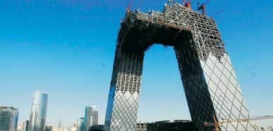
Curves and elegance are out. For that angsty, post-9/11 feel it’s all about awkwardness, as pioneered by Rem Koolhaas’s “anti-icons” such as Porto’s Casa da Musica and up-and-coming
As worn by Herzog & De Meuron’s De Young Museum,
The natural look
If you’re not going futuristic with crystals and metal, old-style texture, darling, is where it’s at. Pillage history books for materials, the more obscure and arcane the better – wattle and daub, anyone? Make it locally grown, organic, single estate, tweedy. Make it authentic. This has to look hand hewn. But – this is a cast-iron rule – partner with a determinedly directional shape or approach – Hadid-ish curves, crystals, blocky modern, engineered wood – lest someone mistake you for the Prince of Wales. Think twist with a classic, not classic with a twist, and definitely not classical.
As worn by the patron saint of the slow architecture movement, Peter Zumthor – see his latest in the
ON THE TURN
Nu-rave
Like I said, it’s all about texture now, and visual depth, not the instant thrill of acid colours. That’s too “icon building”, too try-hard. You can just about get away with it if used as accents or if the colours are easily changed when the attraction of lemon-yellow palls. Sadly this is all the rage with the corporate behemoths building our new schools and hospitals, so invest in sunglasses now.
As worn by Denton Corker Marshall’s Civil Justice Centre,
LIKE, SO OVER
The wedge and the stepped profile
Basically a cheap way of getting extra storeys through planning permission, the idea being that if the top of the building starts at the roof height of its neighbour then soars skyward, you won’t notice the 20 storeys crammed in. The stepped profile does similar with a complex of several buildings arranged like siblings of increasing, then descending heights. It is also thought,
erroneously, to create a more elegant skyline. No need for it any more, however, because
As worn by the skyline of post-bomb
Leave a Reply
You must be logged in to post a comment.