A landmark in the history of British museum and one of the most significant projects of Norman Foster, the great court has reclaimed London’s most lost spaces and transformed the visitor’s experience of the museum giving the city one of its most remarkable public space.
The layers of history were peeled back to open it up once again as the heart of the building. The Great Court is both a new organizational hub and the catalyst for the Museum’s reinvigoration the once virtually secret world of the Reading Room is now available to all.

Beneath Its own glass sky the Great Court has created new ways of accessing and enjoying the Museum’s collections and has pioneered patterns of social use hitherto unknown within this or any other museum. The Great Court is a new kind of civic space -a cultural plaza – which people are invited to use and enjoy from early in the morning to late at night In a crowded city and a busy Museum it is an oasis.
It followed that the Great Court offer an urban experience in microcosm. Unlike other museums, where the first thing you see is the gift shop, as you enter the Great Court from the south, the drum of The Reading Room sits before you In the courtyard like rotunda surrounded by the hustle and bustle of the Museum.Greats Court is more that a restoration, it is creation of something powerful distinctively new. It mixes urban design and architecture and confronts the language of classism with computer generated computer design.
Foster allows both structure to coexist by turning the negative into positive space. The Greats Court appear to take its character form its surroundings but it is anything but passive,

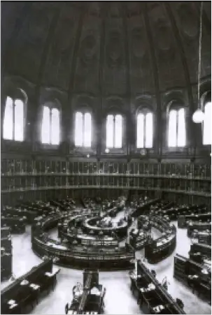

Transformation Of The Great Court
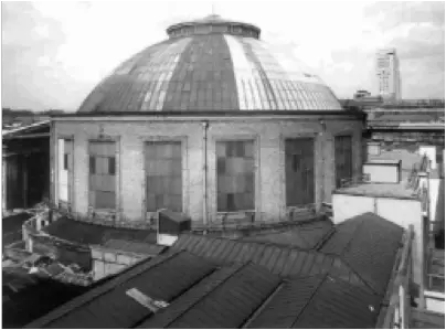
The courtyard only existed in its original state for a brief period between 1847 and 1854. According to Panizzi’s assistant –who cannot be considered entirely Impartial – it was a ‘dead loss: The courtyard was once symmetrical with a portico in the centre of each façade (only the south portico opened onto it, the others being ‘blind’). But the south portico was destroyed to extend the entrance hall in 1870. after the Library had opened. Together will1 the destruction caused by the steady accretion of makeshift additions in the courtyard over the years, the building suffered
bomb damage during World War II. If you are rebuilding architecture with such a complex history, what do you do? How much do you restore? How far do you pretend that new work is In fact old? Smirke had wanted an open courtyard, so In the interests of historical authenticity, do you demolish the Reading Room? Or do you plough the courtyard up, and devote it to growing exotic botanical specimens, as Smirke envisaged? Clearly not.

Foster and de Grey believed that, for the Great Court to read as a coherent space, would be necessary to reconstruct the missing south portico. It is not an exact replica but a new design that reflects contemporary realities.


The Reading Room, encased in stone, girdled by sweeping twin staircases, stands at the centre of the Great Court as a monumental rotundas, connected only by the most tentative of glass links to Smirk’s Museum to allow access from the existing upper level galleries. Everything else is kept low-key.
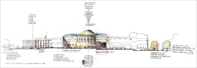
Access to the rest of Fosters work at the Museum -the lower-level lecture theatres, the Locker rooms fir school parties – is from a pair of stairs sunk into unobtrusive openings pressed against the south wall of the courtyard.
To the north, in what will be the Welcome Gallery, another pair of stairs lead to the new Sainsbury African Galleries.
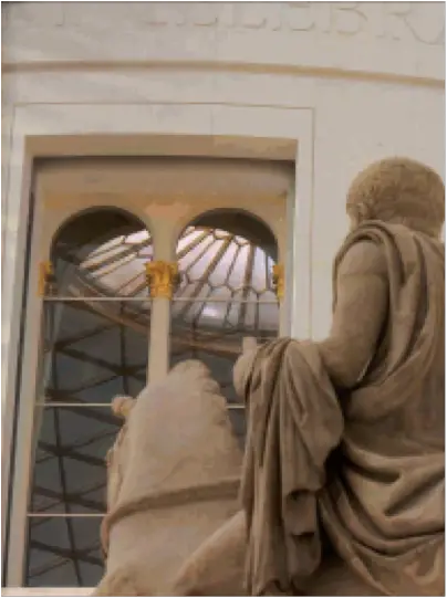
As a visitor you we aware of the powerful presence of $w stone clad drum of the Reading Room even before you reach it. In the entrance hall that Smirke built, daylight now filters gently in , urging, you on till you find yourself under the roof, with its fascinating optically dynamic structure,

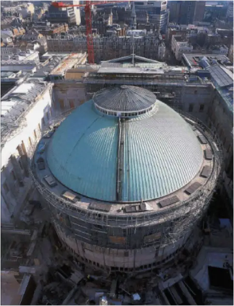
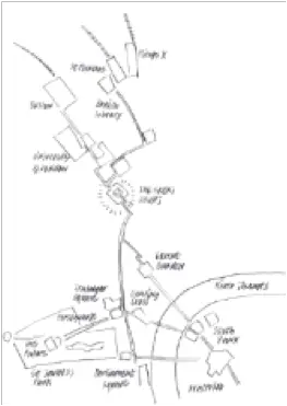
First, it addresses urban Issues. By sinking the galleries and lecture theatres beneath the floor of the courtyard itself raised up to match the main Museum floor – Foster has freed up space in the courtyard itself. Thus it has become a great urban space – not just the heart of the Museum but related to the city beyond, part of a pedestrian route from Bloomsbury to the Thames. Visitors can now enjoy a sequence of spaces riot so far removed from Smirke’s original intentions. They move from the forecourt that he created facing Great Russell Street, through the triumphal colonnade at the front of the Museum, through the richly painted entrance hall into a sudden explosion of light and space beneath the billowing glass and steel roof. From there they may now continue, circulating around the drum of the Reading Room and exiting the Museum on the other side.
Secondly, Foster confronts the issue of how to deal with such an important monument as the British Museum and the extent to which historical authenticity is possible. The courtyard only existed in its original state for a brief period between 1847 and 1854. According to Panizzi’s assistant –who cannot be considered entirely Impartial – it was a ‘dead loss: Another critic called it ‘the finest mason’s yard in Europe. The courtyard was once symmetrical, with a portico in the centre of each façade (only the south portico opened onto it, the others being ‘blind‘.
The third key issue that Foster faced was what to do with the external ,walls of the Reading Room. The building originally had a brick skin, which by the time of the competition had been pierced with modern rectangular window openings. Foster’s original plan was to place around the Reading Room a two-storey-high ellipse of accommodation, which would have come lo within 7 meters (22.75 feet) of the south portico. This was modified to became an ovoid, tiered stack of accommodation, which wraps around the e circular drum of the Reading Room to the north, accessed via a symmetrical pair of staircases, culminating in a restaurant terrace, level with the pediment of the north, portico. The drum at the Reading Room are faced with limestone, matching the floor of the courtyard. This has The effect of turning the Great Court into a formal, unified space.


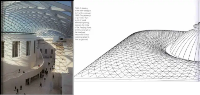
Tile roof s also designed with responsible use of energy for climate control In mind. The ambition was to naturally ventilate the space. Fresh air is supplied through grilles at the edge of the roof and at the main floor level: In winter these can be used to heat the incoming are. The intention is not to climate control the entire volume, just the zone occupied by people.
Structural System :
The roof had to cover an area measuring I 0 0 by 70 meters (325 by 227 feet) and span lengths varying from 14 metres (45.5 feet), where the Reading Room is closest to the courtyard’s facades, to 40 meters (130 feet) at the corners of the courtyard. And it had to be vaulted in order to clear the porticoes at the centre of each facade but it also had to be shallow enough to minimize the visual Impact on the streets surrounding the Museum. At the outer perimeter the roof rests an Smirke’s original load-bearing masonry walls, connected by short steel columns to a new reinforced-concrete parapet beam. To avoid applying any sideways load to the quadrangle buildings, the roof is supported on sliding bearings. These allow the structure to move naturally.

General
Cost of project: l00 million pounds
Gross project area: 22.600 square meters
(243,265 square feet)
Architect :Foster and Partners
scheme announced: 24 July 1904
Construction Begun: 2 March 1998
Official Opening: 6 December 2000
The Great Court
Area of inner courtyard: 71 00 square metres
(76,400 square feet)
Weight of concrete used to build the foundations and new principal floor of the courtyard: 16,000 tomes
Volume of material removed in the demolition process:20,000 cubic metres (26,180 cubic yards) .
Weight d stone quarried stone to build the south portico: 1,500 tonnes
Largest piece of stone. 7 tonnes
Area of restored courtyard facade stonework: 6,000 square metres
the Reading Room
Reading Room ground floor area: 1,350 square metres (14,530 square feet) –
Height from the floor to the apex of the dome: 33 metres (107 feet)
Diameter of dome: 43 metres (140 feet) –
Diameter of lantern :12 metres (39 feet)


If the Museum can be thought of as a city. Then the Great Court is its civic square. It is a major new social space for Londoners and has already become a popular rendezvous for those living and working in Bloomsbury.
The great court through out history had gone under transformation, but the very intervention by Sir Norman Foster, had completely changed the essence of the space. This a the eclectic example of how two historic buildings are connected by an contemporary design element to give a new space to the city and add meaning to the existing construction.
An urban experience in microcosms; the light flooded the public space of great court offer a architectural unlikely in London. There in an ease of understanding space and the movement pattern by the user. People claim this place as their own.
The ovoid structure that wraps around the drum of the Reading Room creates enclosures for much needed new accommodation, but its form has also been designed to aid movement around the Court. It swells and recedes in relation to the perimeter of the space, creating a dynamic Interplay between the two.
The great court can be easily called as a covered urban space, which marks the marriage between the two era in history architecture and construction technology. A alliance of geometries with digital codes.
The layering of spaces both horizontally and vertically clearly delineates the various layers of transformation the space had gone through. A new civic space beneath the glass sky to the new urban generation.


Leave a Reply
You must be logged in to post a comment.