- Robert Venturi graduated summa cum laude from Princeton University in 1947 & received his M.F.A. there in 1950
- Worked under Euro Saarinen & Louis Kahn before forming his own firm with John Rauch.
- As a faculty member at the University of Pennsylvania, Vent
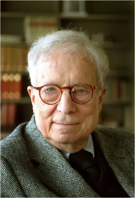 uri met his future wife, the architect and planner Denise Scott Brown, who joined the firm in 1967
 - Rauch’s resigned in 1989, and the firm was renamed Venturi, Scott Brown and Associates, Inc.
- Robert won the Pritzker Prize in 1991
- He was a controversial critic of the purely functional and spare designs of modern orthodox architecture and was considered a counterrevolutionary. He published his manifesto, Complexity and Contradiction in Architecture, in 1966. “Less is More”
- Venturi’s criticism of late modernism began gaining traction by the late 1970s. Many who had maligned the firm’s work years earlier now became converts, including Philip Johnson, who borrowed liberally from Venturi’s Vanna Venturi House for his AT&T skyscraper.
ROBERT VENTURI’S PHILOSOPHY
In Complexity and Contradiction, Robert V
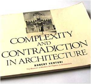
enturi issued his “gentle manifesto” against what he termed “the puritanically moral language” of late modernism. Robert Venturi asserted that the modernists had, in their revolutionary zeal, simplified and clarified architecture to the point of separating it “from the experience of life and the needs of society” While this simplification resulted in some beautiful buildings, the major result in the later years of modernism was a pervasive blandness or, as Robert Venturi put it in his rewording of Mies van der Rohe’s famous dictum, “Less is a bore”.
Perhaps the most influential aspect of the book was its exuberant embrace of historical example as a source for contemporary inspiration. Modernism had eschewed historical reference, asserting that the past was irrelevant to modern architectural concerns. Robert Venturi, however, found rich lessons in the full range of the world’s architecture, and illustrated Robert Venturi’s theories using examples from many periods and styles. This acknowledgment of the continuity of architectural experience helped bring about the rapprochement with the past that has been a major characteristic of architecture in the 1980s.
THE DUCK & THE DECORATED SHED
- After publishing Complexity and Contradiction, Venturi
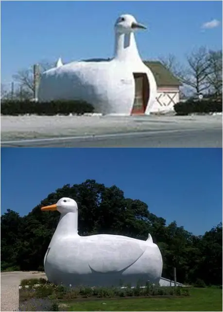 promotes the architectural metaphor of the duck & the decorated shed
 - The duck is a building type where it’s shape/form gives a clear message of the functions of the structure.
- However, Venturi favours the decorated shed–a simple, even boring building which literally has a sign placed in front of it telling the purposes or functions of the building
- These messages are conveyed through the use of cultural symbols or even written words
- Any symbol is appropriate whether formal or kitsch as long as the message is understandable to its audience
- This application of symbols to the building form has been a long tradition throughout architectural history (which Venturi argued in Complexity and Contradiction), a tradition which was only recently lost in the architecture of the modern era.
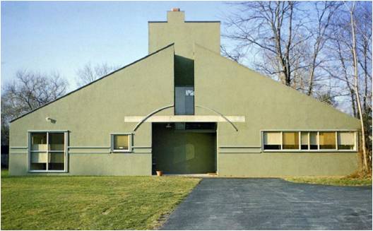
VANNA VENTURI HOUSE (1964)
- “Mother’s House” based on the symbolism of a central hearth.
- References to historic architecture include: Michaelang
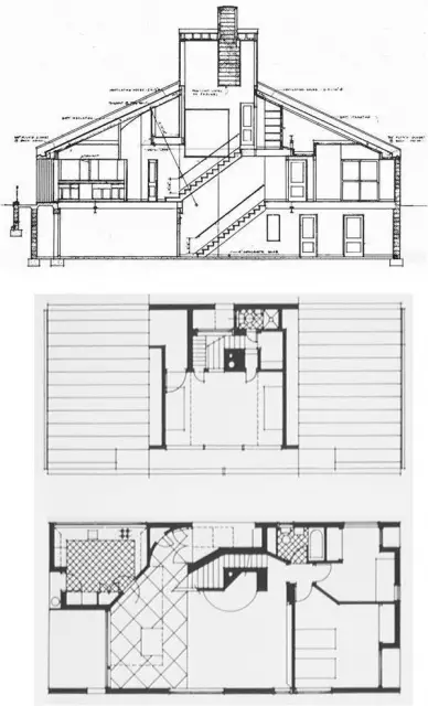 elo’s Porta Pia in Rome the Nymphaeum at House in Greenwich, CT 1972 Rome, Palladio and Alessandro Vittoria’s Villa Barbaro.
ALLEN MEMORIAL ART MUSEUM (1976)
- Extension to a distinguished building by
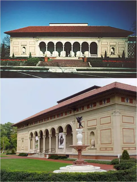 Cass Gilbert.
 - Harmonized with Gilbert’s symmetrical Renaissance pavilion through the careful matching of materials and colours.
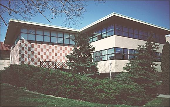
FRANKLIN COURT, 1976
- Museum & memorial to Benjamin
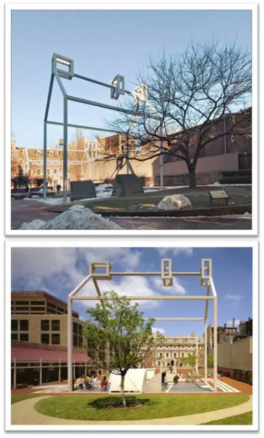 Franklin,
is on the site of the home Franklin built for himself. - The main exhibit area is underground with a steel “ghost” structure to represent the original house. This preserved as open space the site of Franklin’s garden.
- Viewing ports allow visitors to see the few archaeological remains of the house.
- Franklin Court is one of the most visited attractions in Independence Park. It serves as a quiet oasis off a bustling commercial street. Venturi, Rauch and Scott-Brown given the Presidential Award for Design Excellence.
PRINCETON UNIVERSITY PROJECTS, 1980s
AWARDS:
- Honor Award, American Institute of Architects, 1987.
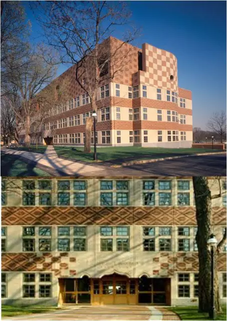
Lewis Thomas Laboratory, 1983 - Gold Medal, American Institute of Architects, Philadelphia Chapter, 1986
- Honor Award, Pennsylvania Society of Architects, 1986
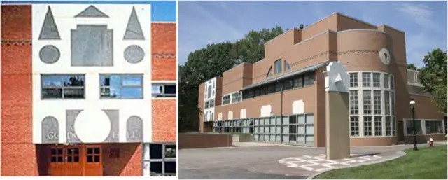
SEATTLE ART MUSEUM, 1991
- Exterior designed to be a work of art itself yet also function like the ‘grand old’ museums of the past inside with loft-like
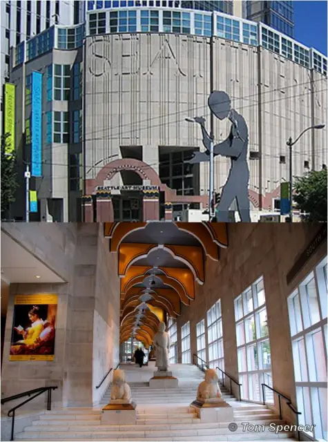 unadorned gallery spaces
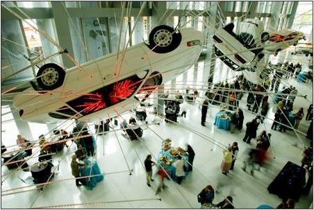
CHILDREN’S MUSEUM OF HOUSTON, 1992
- Example of Venturi’s “shed” concept—a boring building
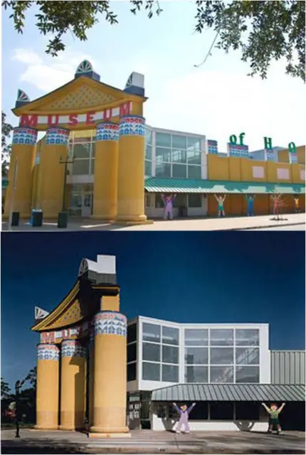 made from pre-fabricated metal.
 - However, the stucco pilasters, columns and pediment give the building symbolic meaning and a link to a greater architectural tradition.
- Side walkway is supported by fibreglass “caryakids” — multi- colored, larger-than life cut-outs of children clearly communicating the intent of the space.
NATIONAL GALLERY, 1991
- Renovations had been delayed after Prince Charles
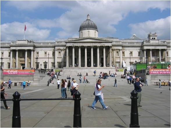 denounced a modernist design by the architects Ahrends, Burton and Koralek as “a monstrous carbuncle on the face of a much-loved and elegant friend”.
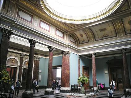
 - The Sainsbury Wing is subdued by Venturi’s standards, superficially blending in with the Wilkins façade while giving a quirky comment on classical architectural forms.
SELECTED AWARDS:
- The Benjamin Franklin Medal Award,
 1993
1993 - Honor Award, The American Institute of Architects, 1992
- Arts Access Award, First Winner, 1992
“I felt I had to write and say how enormously impressed I have been by your extension to the National Gallery… The Trafalgar Square elevation is a great success, but the interior spaces of the gallery area triumph. I do congratulate you on what you have achieved…”
— Charles, Prince of Wales, National Gallery, London
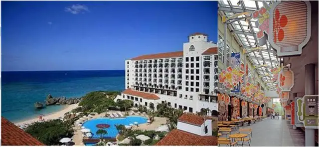
NIKKO RESORT,1997
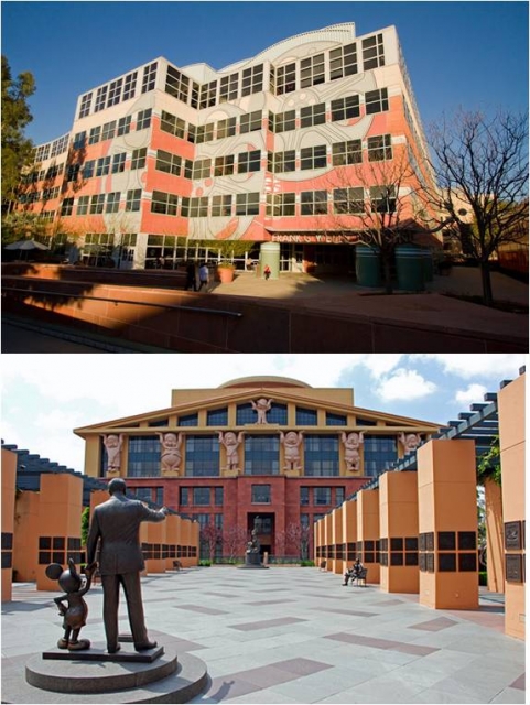
FRANK G. WELLS BUILDNG, 1997
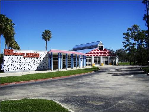
WDW FIRE STATION, ORLANDO, 1992
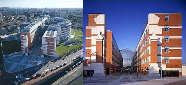
TOULOUSE, FRANCE CAPITAL BUILDINGS 1999
- ‘Shed’ concept further developed to include ‘Talking Sheds’ with LED light displays
- Scott-Brown on the LED displays:
“They stand in contrast to the masonry of the buildings, much as the blossoms on the altar stood against the thousand-year-old temple, and they permit an immediacy and variability of urban communication that would astound architectural propagandists of earlier eras, who incised their messages in stone.”
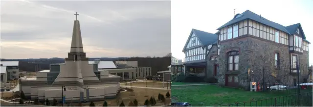
EPISCOPAL ACADEMY, PENNSYLVANIA
The Episcopal Academy was founded in 1785 by the Rt. Rev. William White at Old Christ Church in Philadelphia, Pennsylvania as an all-boys school focusing on education in Greek, Latin, religion, mathematics, and business. It was also a pre-missionary school. The school was designed by Robert Venturi.
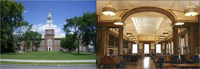
BAKER MEMORIAL LIBRARY
Baker Memorial Library at Dartmouth College is one of the most noteworthy architectural works in New Hampshire. The design of the building suggests Independence Hall in Philadelphia combined with the graceful spire characteristic of early New Hampshire churches.
DUMBARTON OAKS MUSEUM, WASHINGTON D.C.
The mansion was built in 1800. Famously, it was the Washington residence of U.S. Senator, official, and Vice President John C. Calhoun. It was purchased in 1920 by Robert Woods Bliss (1875-1962), a long-time member of the Foreign Service and his wife Mildred Barnes Bliss (1875-1969), a prominent art collector and daughter of Demas Barnes.

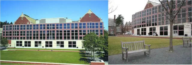
FIRST CAMPUS CENTRE, PRINCETON UNIVERSITY
First Campus Centre is a focal point of social life at Princeton University. The campus centre is a combination of the former Palmer Physics Lab, and a modern addition completed in 2001.
Designed by Venturi, Scott Brown & Associates, the firm of acclaimed architects Robert Venturi (a Princeton alumnus) and Denise Scott Brown, the building consists of a modern expansion to the existing Collegiate Gothic Palmer Hall. The new building volume fills in the courtyard of the previous C-shaped structure, and extends across its open side to create a new east facade.
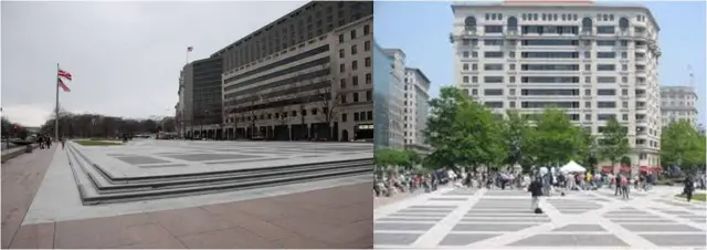
FREEDOM PLAZA, WASHINGTON D.C.
Freedom Plaza, originally known as Western Plaza, is an open plaza in Northwest Washington, D.C. adjacent to Pershing Park. Freedom Plaza and Pershing Park were part of a design competition won by M. Paul Friedberg (Pershing Park) and Venturi, Rausch and Scott Brown with George Patton landscape architect (Freedom Plaza).
Named in honour of Martin Luther King, Jr. and opened in 1980, this modernist plaza set on a raised terrace platform and separated from the surrounding streets by a series of steps, is a partially realized design because of concerns expressed by chairman of the Fine Arts Commission, J. Carter Brown. Composed of simple elements, the pavement consists of a large 1887 map of Pierre L’Enfant’s federal city delineated in black granite and white marble, grass panels representing the Mall and the Ellipse, and bronze markers denoting the Capitol and the White House.
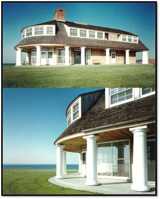
RESIDENTIAL PROJECTS
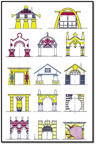
- An imaginary, minimal vacation house serves as a point of departure for a theoretical exercise on the idea of the decorated front and the ordinary behind. The house series is an homage to Loudon and a response to the analyses of ‘Learning from Levittown’. In it, style and function are juxtaposed, not distorted; and styles are applied to the front, while plan, section and the other three elevations remain constant.
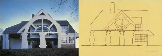
House in Northern Delaware
FURNITURE
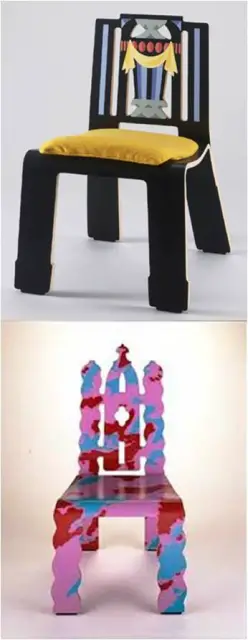
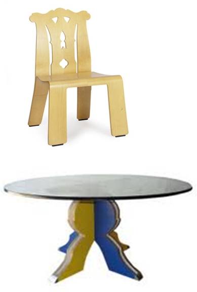
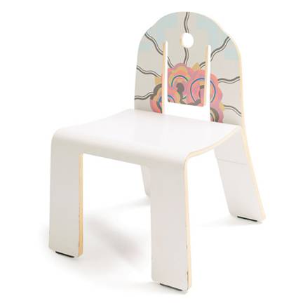
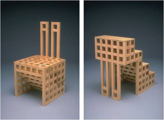
The furniture for Knoll broke the boundary between Traditional and Modern design by using historical styles with an industrial processes and symbolism and decoration in a Modern way. Made of moulded, laminated plywood.
PALAZZO DELLA CANCELLERIA, ROME
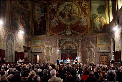
Palazzo Della Cancelleria incorporates the church of San 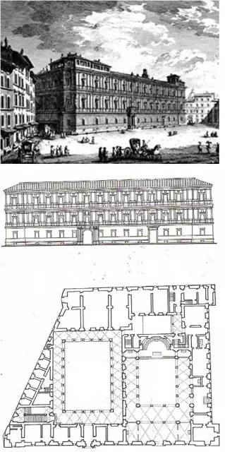 Lorenzo in Damaso ,it was built by Cardinal Raffaelle Riario, whose name is carved on the façade ,but subsequently it became the papal chancery ,from which it takes its present title .the palace is a work of a man who is profoundly influenced by Alberti and the quality is so much higher than contemporary work in Rome that Vasari and others have attributed it, in whole or in part, to Bramante .it is however beyond doubt that the palace was begun before 1489,but longer after the death of Alberti ,the cardinal was already living in the palace by the mid nineties and Bramante did not arrive in Rome until1499.the palace is so huge that was not completed until about 1517,so it is sometimes suggested that Bramante took part in the design and built the court after his arrival in Rome.
 façade (295 ft) and is proportionately high, so that is was necessary to break up this great mass of masonry both vertically and horizontally .the prototype was Alberti’s rusticated Palazzo Rucellai in Florence which in turn derived from the Colosseum .it was 90 ft wide and 65 ft high ,it was thus possible to break the façade into three horizontal layers by means of the entablatures ,and to obtain all the relief necessary in the vertical plane by single pilasters .the door bays are slightly wider than the others ,but that is all.
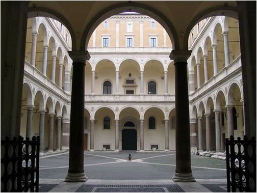 The ground floor itself has a rusticated surface with evenly channeled blocks and rather small round –headed windows in a rectangular frame but without an order. the piano mobile has an apron of smooth walling as a base both for the windows and for the coupled pilasters ,while the windows of this floor are emphasized by having round headed openings set in a rectangular frame with a projecting cornice ,the spandrels of which are decorated with pate race .this is a form used in ancient buildings ,but it is used here for the first time in the fifteenth century .
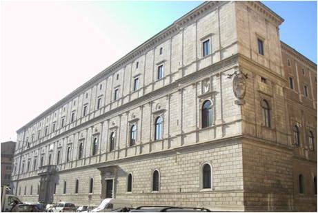 Nobile,except that the windows above them. The rustication is even all the way up the façade and no attempt was made to give more massive air to the ground floor by heavier rustication like that of contemporary Florentine palaces .
Wood, wine, and oil would be stored on the ground
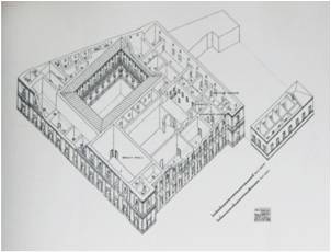
floor of the back wing where the cellars and kitchens were situated. Most of the three hundredth of familiars serving Cardinal Riario lived on the upper or mezzanine stories and their ate their meals in the two large dinning halls near the kitchen.
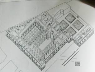 to the piano nobile. Riario certainly must have gone and welcomed the pope personally when he visited but other guests of high standing would had been met at the threshold and led up the first flight of stairs. Following the ceremonial welcome these guests were led up the large staircase, through the upper loggia, and into the great hall. This is an excellent example of hierarchy in society reflected in architecture.
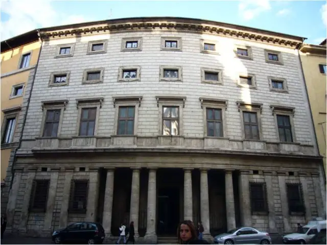
- The curved façade was dictated by foundations built upon the stands for the stadium (odeon) of the emperor Domitian.
- It fronts the now-busy Corso Vittorio Emanuele, a few hundred yards from the front of the church of Sant’Andrea della Valle.
The Palazzo Massimo alle Colonne is a Renaissance palace in Rome, Italy. The palace was designed by Baldassarre Peruzzi in 1532-1536 on a site of three contiguous palaces owned by the old Roman Massimo family and built after arson destroyed the earlier structures during the Sack of Rome (1527)
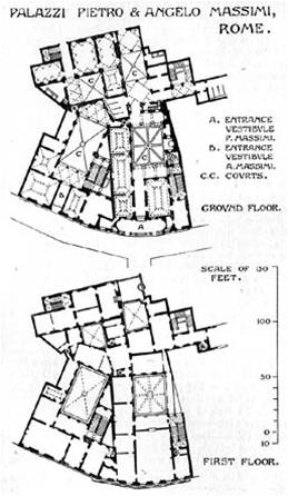
The entrance is characterized by a central portico with six Doric columns, paired and single.
Inside there are two courtyards, of which the first one has a portico with Doric columns as a basement for a rich loggia, which is also made of Doric columns.
The column decorations gave the name to the palace, alle Colonne. The façade is renowned as one of the most masterful of its time, combining both elegance with stern rustication.
The recessed entrance portico differs from typical palazzo models such as exemplified by the Florentine Palazzo Medici.
There is a variation of size of windows for different levels, and the decorative frames of the windows of the third floor.
- There is no academic adherence to superimposition of order
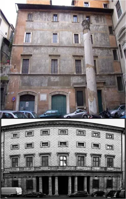 s, depending on the floor.
 - On the opposite façade of this palace, opening onto the Piazzetta dei Massimo, the palace connects with the frescoed façade o the conjoined annex, the Palazzetto Massimi (or Palazzetto Istoriato).
- For many centuries, this used to be the central post office of Rome, a Massimo family perquisite. To the left of the palace is the Palazzo di Pirro, built by a pupil of Antonio da Sangallo.


Leave a Reply
You must be logged in to post a comment.