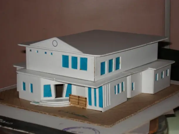
Police Station – 3rd Sem.

Reader Interactions
Comments
Quick Links
- Architects and their Works
- Architecture Books
- Architecture News
- Arts in Architecture
- Building Material & Services
- Buildings and their Structure
- City Architecture
- Earthquake Proof Construction
- History of Architecture
- Hospital Architecture
- Hotel Architecture
- Housing Architecture
- Interior Design
- Landscape Architecture
- Lighting
- Megastructure Architecture
- Old City Settlement Studies
- Other Case Studies
- Public Spaces & Squares
- Religious Architecture
- Sustainable Architecture
- Vernacular Architecture


very very interesting
very very interesting topic—–can u tell me your design processes and your ideas about the design——-tel me wat makes your police station different from lacs of others——-whats wit the main door—-wats wrong with the gable end of wall—-why are there so less windows on the first floor—–plz add a human and a strong base, enhances your model presentation to a great height——-can u show more context——–ok ok do reply—–This is rishi vora,student ,mumbai(vora.rishi@gmail.com)
beautiful approach, try to
beautiful approach, try to avoid flattening the roof near the edges. thats the beautiful part. try to exploit the overhangs, since ur using sloping roof. Overall, good approach. Remember, simplicity gives elegance in modern design.
thanks for ur inputs
thanks for ur inputs guys……..
but now im into last sem of b.arch, if i design it today,i’m sure the exterior will be much better and even the model.
rishi@ the second flr has all the lock up rooms,where the security is must.i planned it with indirect ventilation and full security.the rooms for which windows have been provided are the locker rooms for the police(constables in specification).
wats the actual role of the
wats the actual role of the gable wall…is it only to add that Administrative building look…coz it succeeds in that…any other thought???